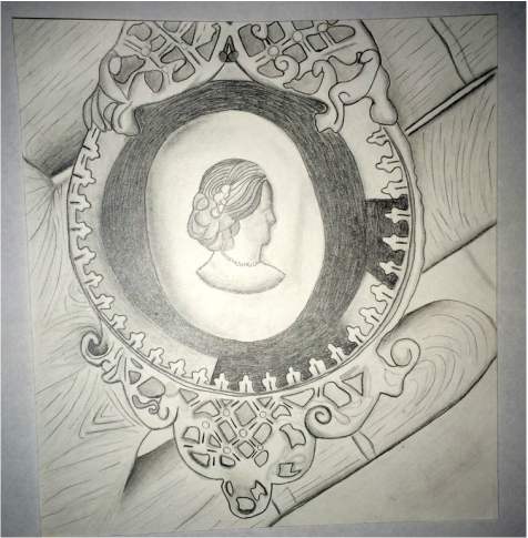
For this project I chose to use the medium with graphite pencil. When originally starting, I used mechanical pencil at first thinking I could incorporate in more detail better, but then chose to switch to different types of pencils with a variation of thicknesses, noticing how some pencils were better with detail where as others were more for shading in darker areas in this piece. Having not been very experienced with using (graphite) pencil in general, I noticed how there were many ways to add in values, one of which being using a tissue for more areas that needed to look more smooth, such as the creases in the fingers. I shaded in areas that needed more detail, like the finger tips, with just pencil.
One concept I tried to apply in this piece was as much detail as I could add without it seeming to be overly done. For example, with the darkest part of the jewelry piece I added in the values, and then shaded over that for more emphasis of the detail. Overall, I was very satisfied with how this piece turned out. If I could focus more on one specific part of using pencil in possible future pieces, it would be to try to improve on focusing more on melding the values and incorporation of details more realistically as it would be in real life. Even with that specific concept described, I really enjoyed how the overall piece looked. It almost had a cartoon like effect which was what made it very enjoyable to create more so than something I could have drawn to seem more realistic.
I definitely plan on using pencil more often in future pieces, or possibly charcoal. It's very interesting to see how using only one color or values of that specific color affects so much differentiation in a piece that would have colors incorporated in it. Another idea in mind for future projects could be using shades of a specific color such as black in this piece, or blue, green, or red in another.
